My Role
Product/UX Designer
Scope
Focus
• Information architecture
• Content design
• Guided onboarding flows
Excluded
• Operational processes
• Internal tooling
Team Caroline Berry, UI Designer
Year 2018
Duration Six Months
exalt Youth is a Brooklyn-based nonprofit connecting previously incarcerated youth with meaningful internships. By partnering with local businesses as internship providers, exalt helps empower young people through real-world work experience.
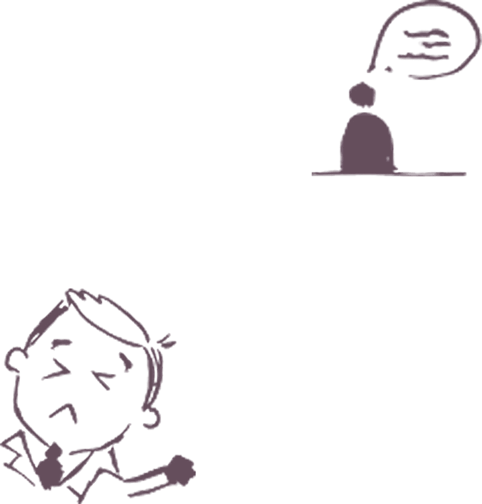
exalt’s only onboarding coordinator was overwhelmed with provider phone inquiries, a clear signal that the existing portal had significant information gaps. The existing site, a static web portal, offered little clarity on the internship process and left providers without enough guidance to move forward.
To address key information gaps, I designed onboarding pages that clarified the internship process, answered common questions, and provided clear next steps so providers could move forward without needing to contact the onboarding coordinator.
To understand the root of repeated provider inquiries, we interviewed past and prospective providers. Providers were contacting support because onboarding expectations were unclear, but exalt didn't yet know what specific information was missing.
Existing Experience
Does the site meet your needs?
What felt unclear or missing?
What would help you take the next step?
– Partner Organization
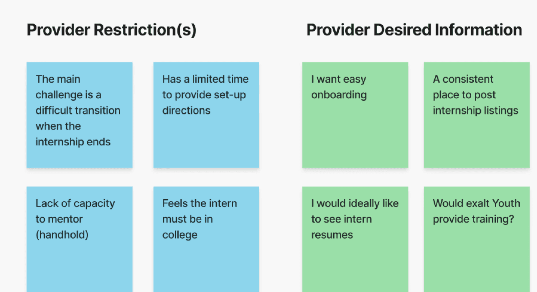
The interviews surfaced recurring concerns around intern matching, job readiness, and visibility into intern backgrounds, none of which were addressed in the current portal. Returning providers also had no clear way to extend placements online and were required to call for next steps.
Research Synthesis

Key Research Themes
Affinity mapping helped surface recurring provider concerns around transparency, readiness, and next steps.


With personas in hand, we analyzed how similar platforms onboard and support partners to identify effective patterns. Across three examples, we found:
These patterns informed how we structured onboarding content, built trust early, and guided providers toward completing key actions.


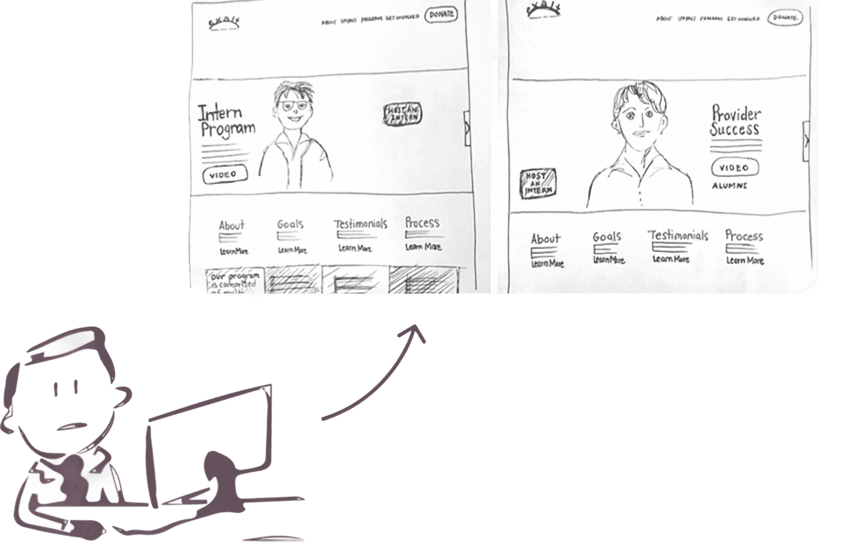


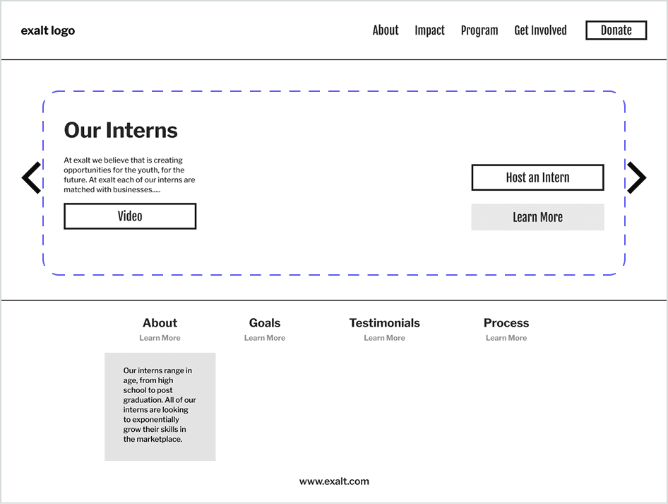
Using the storyboard as a guide, we restructured the original single-page portal into two purpose-driven experiences: a provider page detailing the process, expectations, and past partnerships and a newly introduced intern page highlighting intern stories and testimonials.
Previously, intern content was absent from the portal entirely, which was a missed opportunity to build trust and context for prospective providers.


Taking our low-fidelity wireframes, I then created a clickable prototype for user testing, testing with 3 users, right off the bat, despite having different content, the similar layout and visual hierarchy created uncertainty. This insight prompted a key pivot: low fidelity wireframes didn’t communicate the difference between the pages, the intern page and provider page should be distinct.
Provider Page
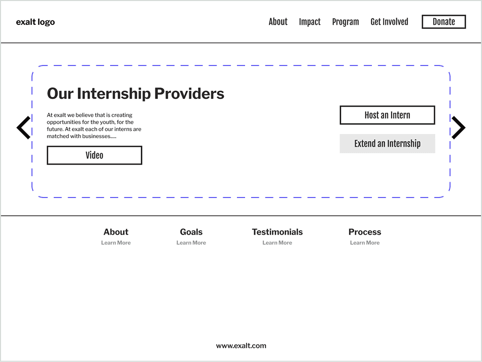
Key Usability Insight
The intern and provider pages were visually too similar, making it difficult for users to recognize they were looking at distinct experiences.
Early usability testing exposed ambiguity between intern and provider views, informing layout differentiation.
The final designs clarified roles, reduced friction, and guided both past and potential providers toward action.
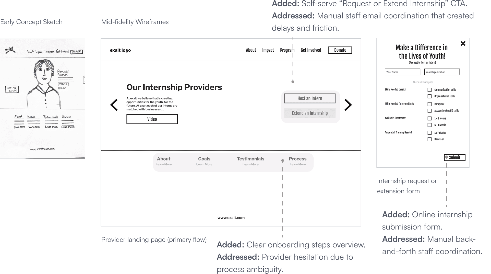
A restructured landing experience, dedicated Intern and Provider pages, a structured onboarding flow, a digital internship request form and a pathway for requesting or extending internships.
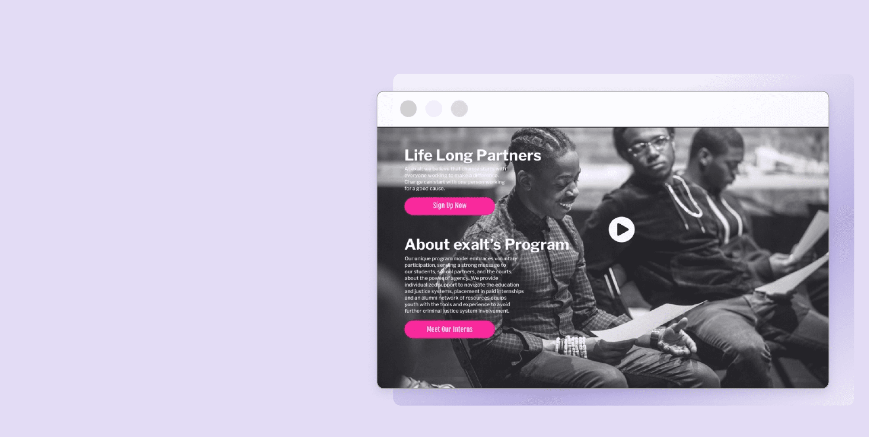
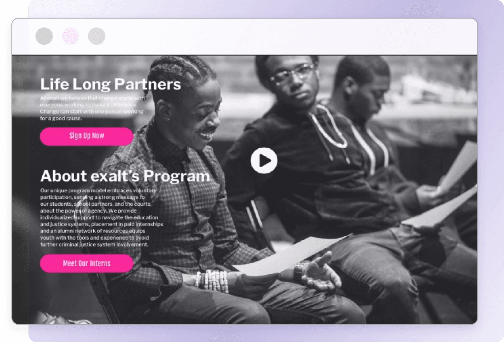
BEFORE - Landing Page

AFTER

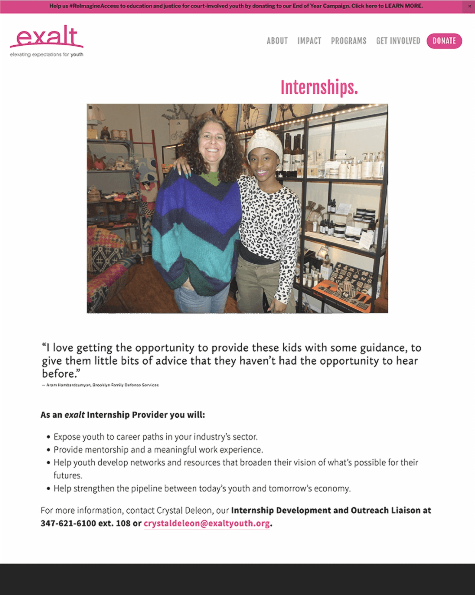
BEFORE - Single Page

AFTER - Split Page


Our final designs enabled providers to:
Complete onboarding through a guided, step-by-step flow
with clear calls to action.Find answers to common questions upfront, reducing friction
and coordinator dependency.Request and extend internships through self-serve workflows.
Next steps for evaluating the redesign include: