My Role
Product Designer (UX/UI, Research)
Scope
Personal Zen helps people manage stress and anxiety through short, science-based interactive exercises, a proven method that helps people break negative thought patterns and build healthier ones.
Gameplay Overview
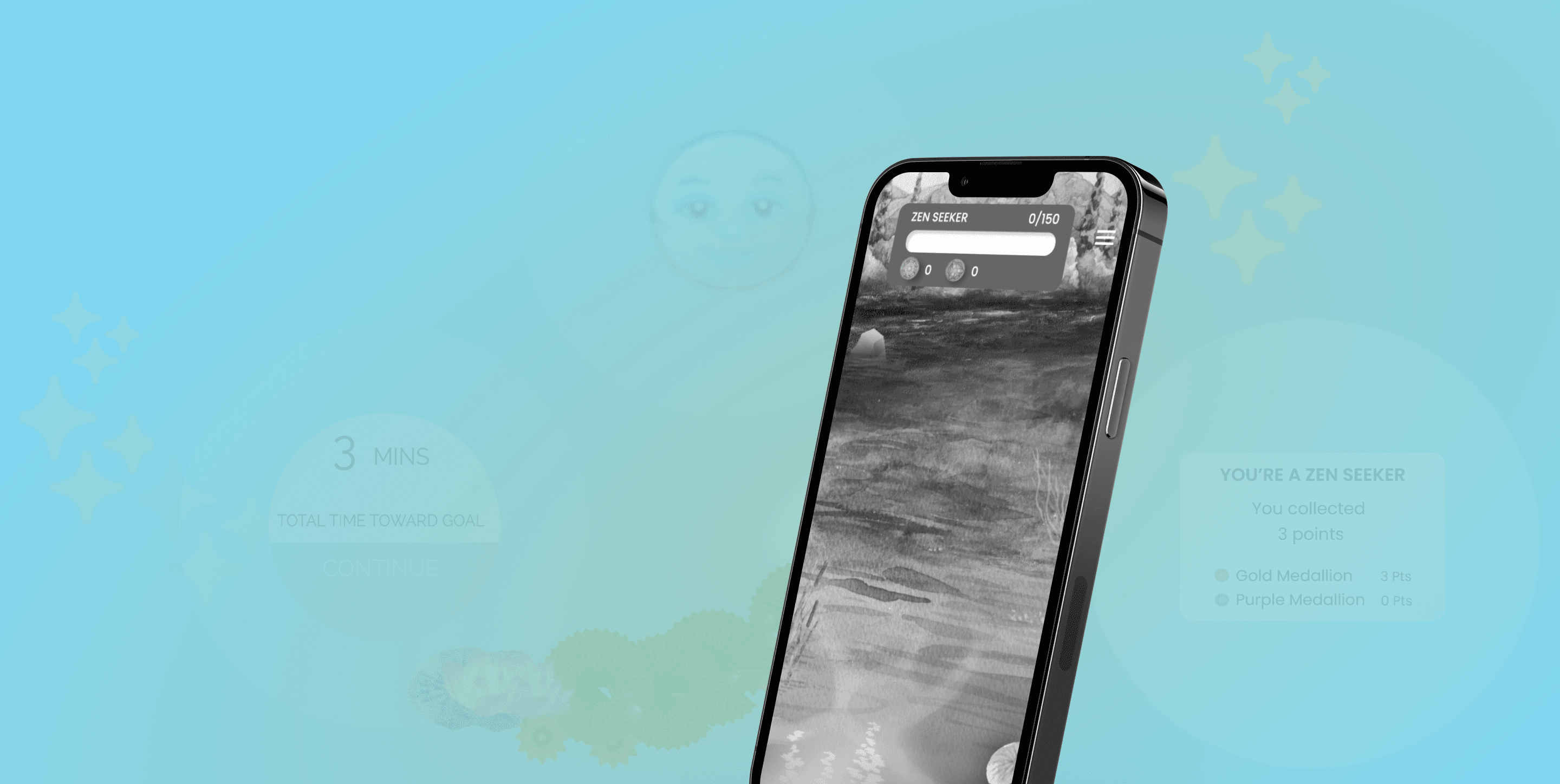
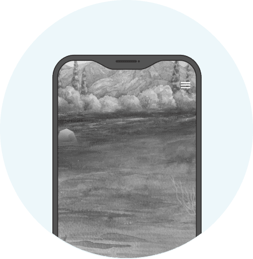
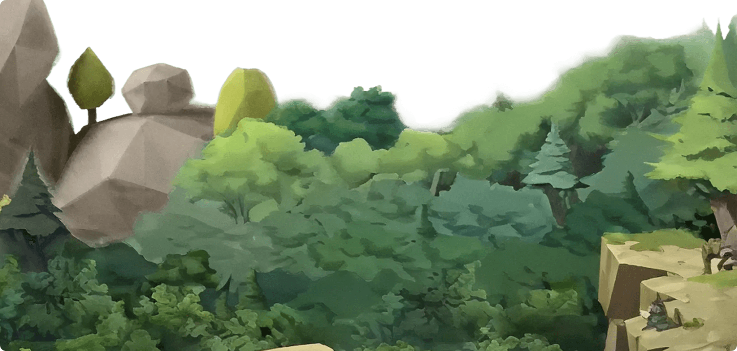
After completing a brief anxiety disorder survey, users enter 3–5 minute play sessions, tracing paths left by positive sprites while avoiding negative ones and earning medallions along the way.
Despite a strong therapeutic foundation, many users dropped off after their first session, suggesting the app wasn't clearly communicating its value early enough to motivate return. App Store reviews flagged the gameplay as repetitive, and many users never reached the app's full therapeutic benefit.
How might we strengthen first-session engagement and motivate return without compromising the app’s calming, therapeutic foundation?
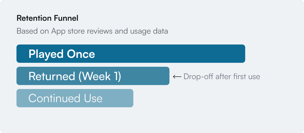
Internal data pointed to two areas of early drop-off for the app: onboarding and the core gameplay experience. With that, I set out to understand where users were losing momentum and why.
To understand where users were losing momentum, I mapped the first-time experience from onboarding to gameplay.

A six-step onboarding added friction before gameplay
Instruction-heavy prompts required excessive reading before interaction

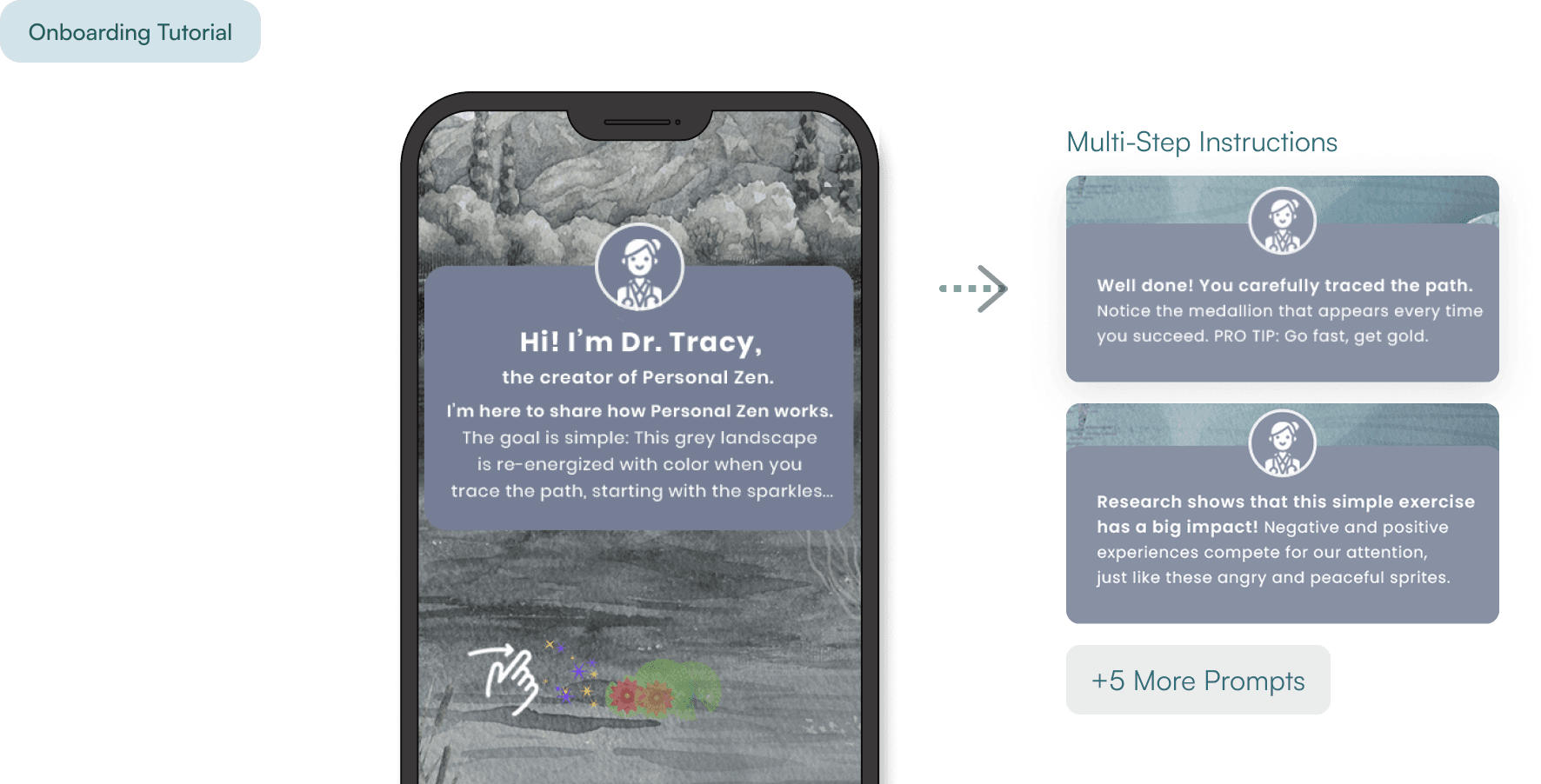


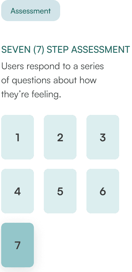
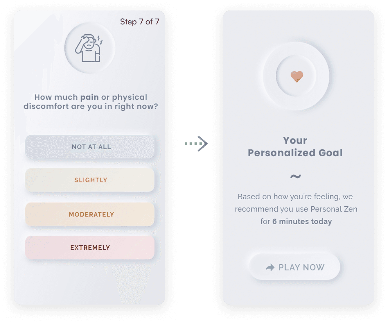
The assessment added value through personalization, but requiring seven screens before gameplay meant users had to commit before experiencing the game.


While playing the game, I swiped on the positive paths as they appeared on the screen while intentionally ignoring negative or unhappy faces.
Each session lasted 3–5 minutes and was designed to be calm and repetitive by intention.
Progress was visually represented through the environment, but it was unclear how this signaled session completion or whether a session had been successfully completed.
Core Gameplay Loop


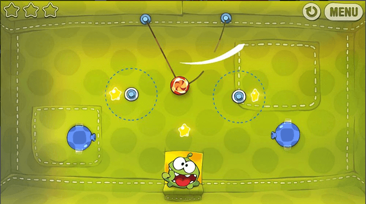
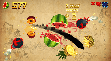
Few wellness apps use game mechanics intentionally, I looked at casual games like Cut the Rope and Fruit Ninja, which use short, repeatable loops and simple interactions. This helped identify which patterns could support a calming experience and which would introduce pressure or distraction.
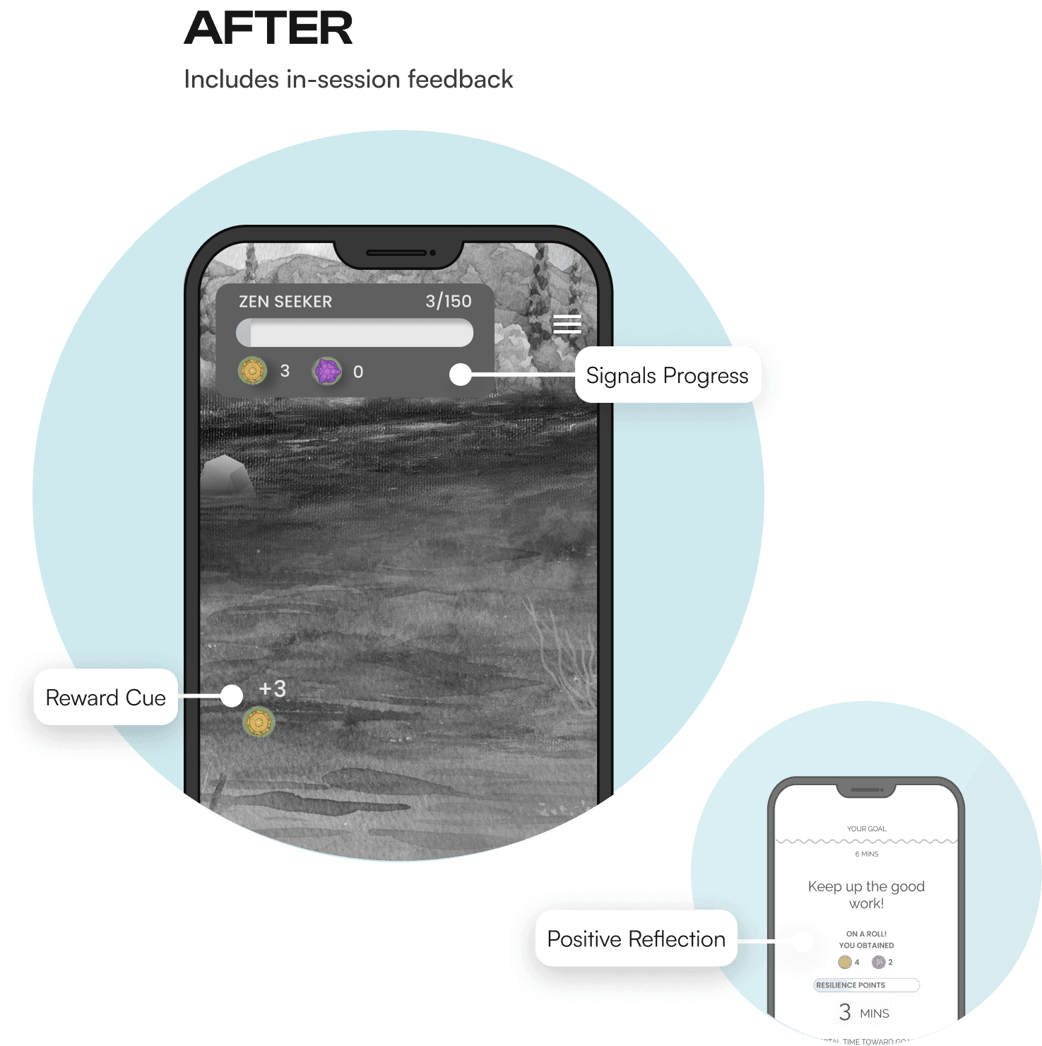
Based on these findings, I redesigned the core gameplay to make progress visible and more meaningful during each session. I removed competitive scoring and introduced lightweight feedback to reinforce progress without adding pressure.


I tested the redesigned experience with nine (9) participants using a high-fidelity prototype, comparing the current and updated flows.
Participants
Who We Tested
Nine (9) Users
How We Tested
45 min moderated sessions (Zoom)
Devices: iOS and Android; some Android users had swipe issues
Research Questions
Was the updated experience
more motivating?Did progress and feedback
feel meaningful?Would you return to the app?
Evaluation Focus
Onboarding comprehension
Emotional response to progress
Replay motivation
Key Decisions
and Outcomes
Adding lightweight gamified elements increased engagement without adding pressure, helping users better understand their progress and motivating return, though some reward mechanics still felt unclear and revealed opportunities to simplify feedback and progression.
Challenge #1
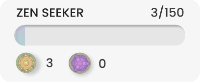
Users found the Resilience Meter and the term “resilient” confusing and evaluative.
Decision
I recommended removing the Resilience Meter and redesigned it as a simpler game summary, reinforcing session completion rather than labeling emotional states.
Challenge #2
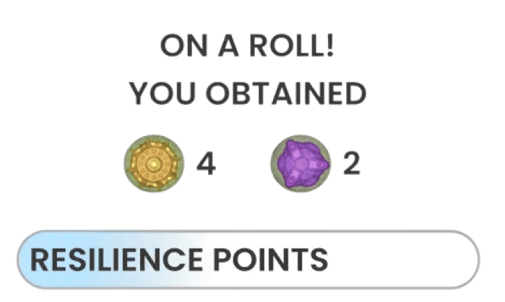
Users were unclear about the purpose of collecting medallions and expected trade-in or reward options.
Decision
I designed multiple reward view directions based on casual game patterns and presented them to stakeholders, who aligned on the simplest version.
These findings shaped the final design decisions carried into the shipped experience.
This validated the shift toward visible progress and lightweight feedback in the redesigned experience. While post-launch retention data wasn’t available, 78% of participants said they would return after experiencing the updated gameplay, suggesting the direction was resonating with users.
“More structured and calming”
“Encouraging without being competitive”
“Rewarding without feeling like a game”
Potential opportunities to improve upon beyond the scope of this project.