My Role
UX/UI Designer
Scope
Built foundational components in Figma and audited key sections of the clinician portal, shipping 40+ reusable components adopted by engineering and reducing design-to-development time by ~30%.
ClinicianConnect is a web-based telehealth platform developed at Health Recovery Solutions (HRS), supporting care teams in managing complex patient data. I worked on features used to triage cases, monitor vitals, and manage care workflows.

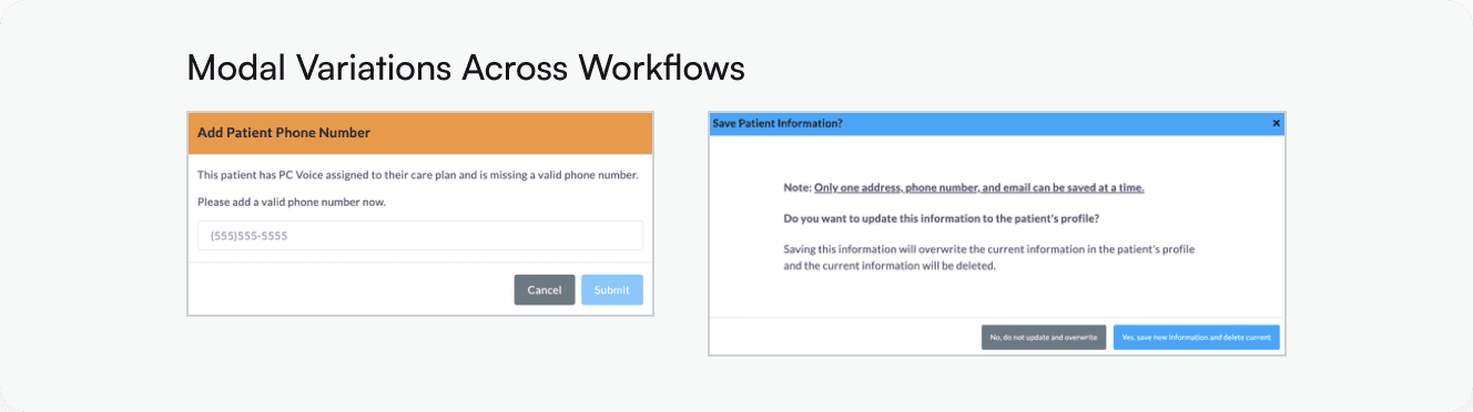
WHERE IT BROKE DOWN
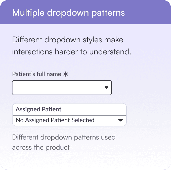
Instead, focus states were often unclear or missing, making it difficult to understand which elements were active during keyboard navigation. Dropdown patterns also varied across screens, creating inconsistent interactions that slowed workflows and increased the risk of error.
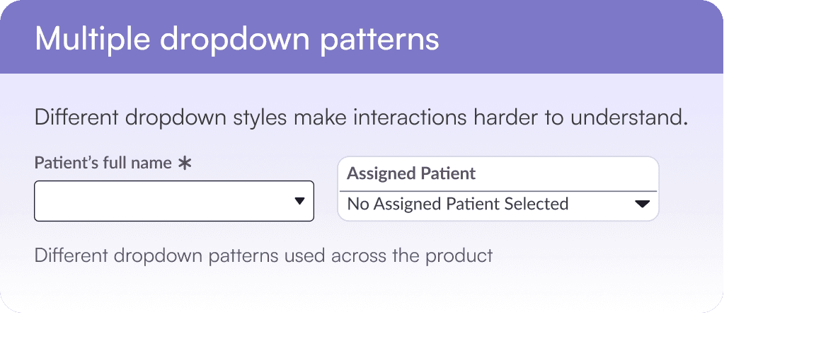
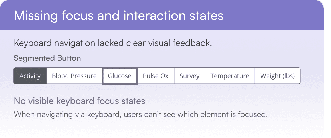
Patterns fragmented as the product scaled without a shared system.
ClinicianConnect had grown without a shared inventory of existing UI patterns, creating variation across workflows as the platform evolved. Introducing new components too early risked adding to the inconsistency rather than reducing it.
Instead of creating new patterns immediately, the team focused on documenting and structuring existing components first, stabilizing the foundation before anything new was introduced.
Observed Validation Variations

01
Default field
02
Required field + success feedback
03
Required field + success + help icon
04
Required field

Variability in input styling and validation states spotted across clinician workflows.
Competitive
Analysis
As there was no shared system for the web platform, the team and I looked at established systems like Material and IBM Carbon to understand how mature systems structure components, documentation, and scalability. Rather than replicating them, we focused on identifying patterns that could introduce structure without over-engineering at our stage.


Comparative analysis informed a lightweight, scalable structure for the initial UI library.
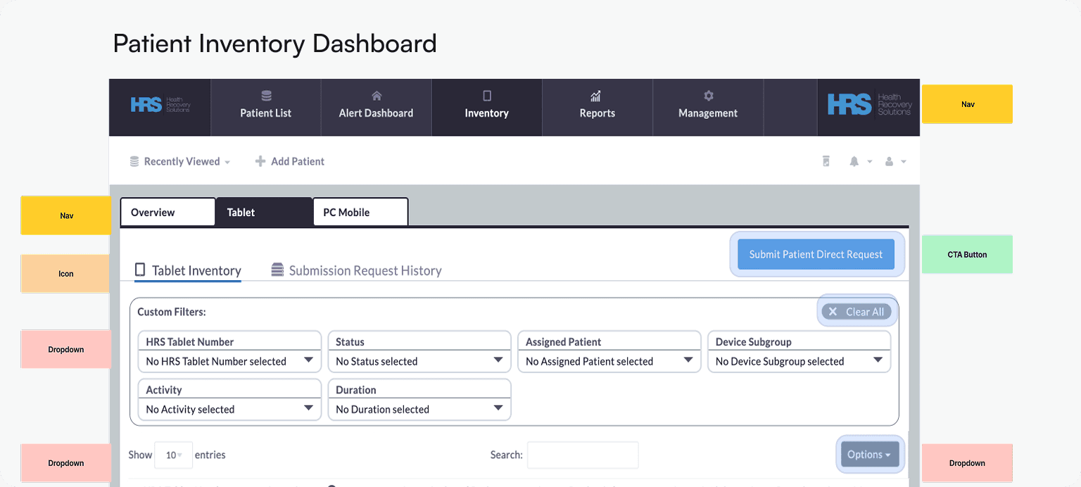
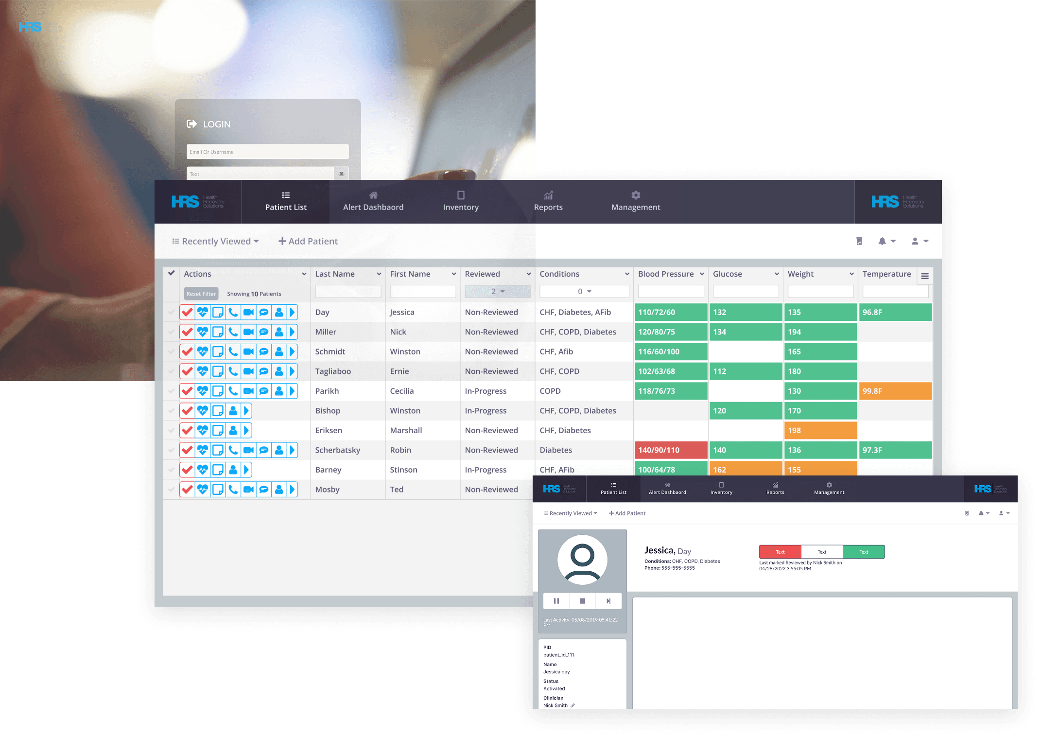
Next, the team divided the platform into key workflows, and I audited dozens of live screens, tagging UI components to create a clear inventory of patterns and inconsistencies across the product.

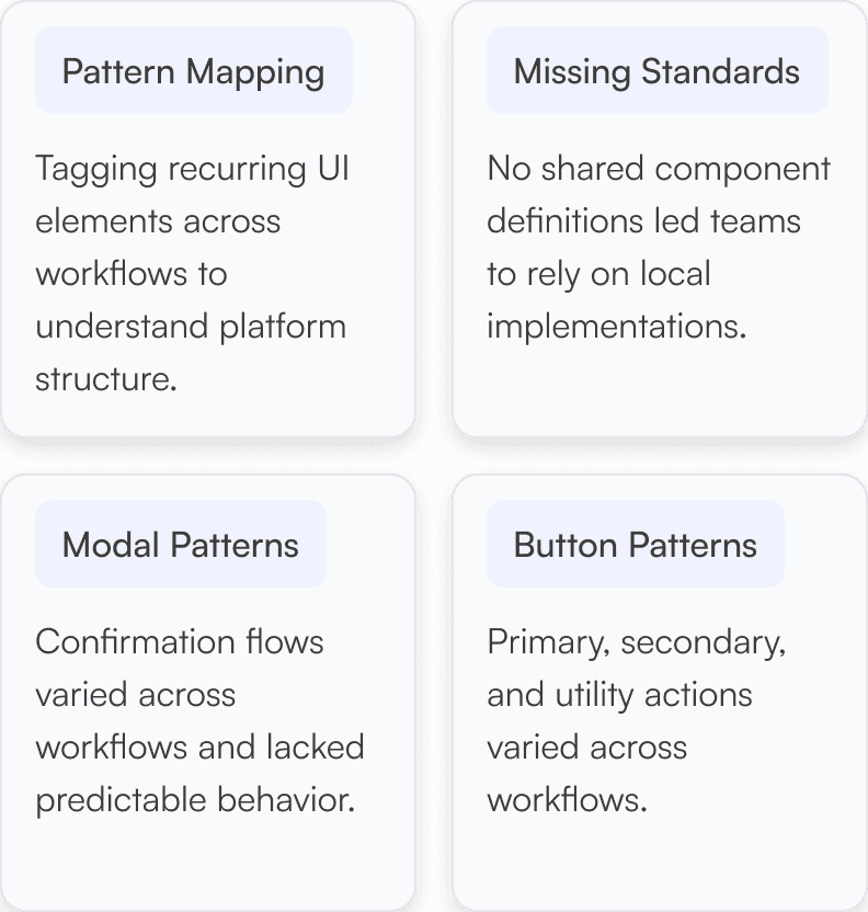


With the audit complete, I used atomic design principles to build from the ground up, starting with typography and spacing before tackling interactive components where variation was highest. I prioritized clarity, reusability, and accessibility so components could be integrated immediately as new workflows were introduced, establishing consistent patterns and reducing redundant implementations.
Visual Foundations
Typography
ClinicianConnect
H1
22px/Semibold
ClinicianConnect
H2
16px/Bold
This UI Library was built to support
reusability across screens and teams
Body Paragraph
16px/Regular
Sizing and Spacing
All component sizing should be in multiples of 8px or 4px, 8px is preferable. Consistent, standard, and scalable.
Example: System modal with real-world copy

Core Components
System in Context
40+
reusable components reduced variation across workflows

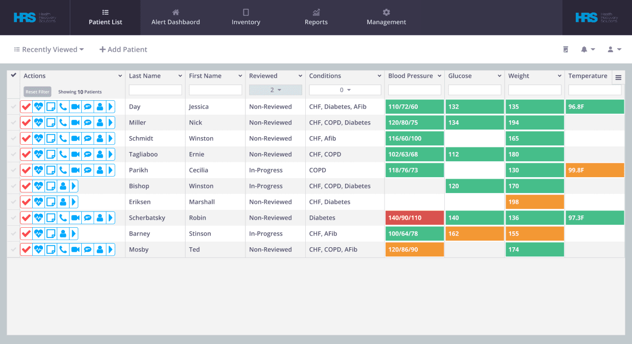


The library became a single source of truth for incoming feature requests, giving teams a reference point to quickly assess what patterns already existed before building something new.
Instead of recreating components feature by feature, design and engineering could build on a consistent foundation, reducing rework and speeding up iteration.
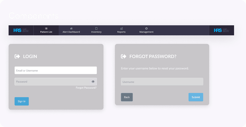
BEFORE
Fragmented component patterns

Inconsistent borders and spacing
No shared validation pattern
Different interaction patterns for
similar inputs
AFTER
Introduced a shared component system across clinician workflows.
INPUT FIELDS


~30%
Cleaner handoffs, reduced rework, faster decisions.
(Estimated from reduced design iteration cycles)
Before wrapping up my contribution, the following priorities were identified to help evolve the library into a more scalable system: